What Museum Photography Teaches Craft Businesses
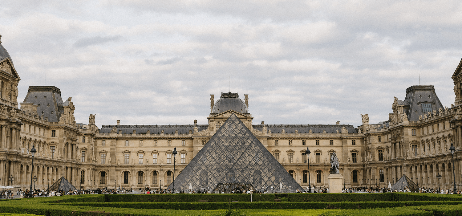
The Louvre doesn’t photograph the Mona Lisa with an iPhone under fluorescent lights. The Met doesn’t shoot its ceramics collection against white seamless with harsh flash. Museum photography exists to reveal material character, preserve cultural record, and communicate why objects merit attention centuries after creation. Artisan brands building work meant to last decades should adopt the same standard—not because you need museum budgets, but because the principles scale to any craft worth preserving.
Share this post
The Philadelphia Museum of Art’s furniture collection includes a Chippendale high chest from 1770. The museum’s photography shows it from multiple angles: front elevation revealing proportion and symmetry, side angle showing profile and depth, detail shots of carved ornamentation, close-ups of joinery where drawer fronts meet case sides.
Each image is lit to reveal three-dimensional form—gentle shadows that show carved relief, directional light that emphasizes wood figure, exposure calibrated to show grain detail in dark mahogany without blowing highlights to pure white. The background is neutral gray that doesn’t compete. There’s no styling, no props, no context beyond the object itself.
These aren’t marketing images trying to sell anything. They’re documentation images preserving cultural record and communicating craft mastery to anyone who understands furniture construction.
A contemporary furniture maker building custom commissions should photograph work the same way. Not because a 2025 dining table belongs in museums (though some contemporary craft work does), but because the documentation standard honors what’s been made.
If you’re building objects meant to last fifty years, document them like institutions that preserve work across centuries.
The Museum Photography Standard
Museum collection photography follows principles refined over decades of institutional practice. These aren’t arbitrary aesthetics—they’re systematic approaches to revealing object character and preserving accurate visual records.
Multiple perspectives that show form completely. Front, side, back, three-quarter views. Overhead shots that reveal plan. Detail images showing construction, materials, maker’s marks. The goal is comprehensive documentation that someone examining images decades later can understand the object without seeing it in person.
Lighting that reveals rather than flattens. Controlled directional light that creates dimension through gentle shadows. Diffused sources that show material texture without harsh highlights. Lighting positioned to emphasize form—side-lighting for dimensional objects, transmitted light for translucent materials, raking light that reveals surface texture.
Neutral backgrounds that don’t distract. Gray, off-white, or black backgrounds depending on object tones—chosen to provide contrast without competition. No patterns, no environmental context, nothing that dilutes attention from the object itself. The background recedes so the object advances.
Accurate color and tonal range. Museum photography captures material color as faithfully as possible—not stylized or “enhanced” for aesthetic effect. If a ceramic glaze is celadon green, the image shows celadon green, not teal or sage or whatever Instagram filters suggest. Color accuracy preserves truth.
Scale references when relevant. Rulers or measurement markers for archaeological documentation. Size comparisons when understanding scale matters to interpretation. The goal is helping viewers comprehend dimensions accurately without physical access.
Consistent methodology across collections. The Chippendale chest is photographed with the same lighting setup, background choice, and compositional approach as Ming dynasty ceramics, ancient Egyptian jewelry, and contemporary glass sculpture. This consistency creates visual coherence across institutions and allows direct comparison between objects.
Artisan brands can adopt these same principles at modest scale.
What to Learn From Museum Front Elevations
When museums photograph furniture, ceramics, metalwork, or textiles, the primary shot is almost always a straight-on front elevation: camera at exact center, parallel to the object’s face, no perspective distortion.
This isn’t the most dramatic angle—that would be a low three-quarter view that creates dynamic perspective and visual interest. But drama isn’t the goal. Accurate representation is the goal.
The front elevation shows:
True proportions without distortion. Width-to-height relationships, symmetry or intentional asymmetry, design balance. When the camera is parallel to the object, proportions read accurately. Shoot from below and the piece looks squat. Shoot from above and it appears elongated. Neither captures truth.
Design clarity without interpretation. The object speaks for itself—no photographic tricks making it more interesting, no forced perspectives creating visual drama it doesn’t inherently possess. If the design is refined, the front elevation reveals that immediately. If it’s awkward, the front elevation shows that too.
Baseline for detail shots. Once viewers understand overall form from the front elevation, detail images make sense in context. But without that establishing shot, detail photos feel disconnected from the whole.
For artisan brands: Lead every portfolio piece with a clean front elevation before showing detail shots, lifestyle context, or artistic angles. This builds trust—you’re not hiding proportions behind clever photography. You’re showing exactly what you’ve made.
The Detail Shot Discipline
Museums don’t photograph entire objects exclusively. Much of collection documentation focuses on details that reveal craft technique, material character, or cultural significance.
A Japanese tea bowl might have twenty detail shots: foot ring showing throwing marks, glaze pooling in recesses, iron oxide spots in the clay body, the exact curve where wall meets base, any repairs showing centuries of use and cultural value placed on preservation.
These details serve multiple purposes:
They prove craft claims. When a museum labels a bowl “wheel-thrown stoneware with natural ash glaze,” the detail shots provide evidence. You can see throwing rings inside the foot ring. Ash glaze shows the characteristic iron-spotted surface and blue-green pooling that only develops in wood-fired kilns. The documentation supports scholarly interpretation.
They reveal what makes specific objects culturally significant. Why does this tea bowl merit museum collection while thousands of similar bowls don’t? The details show why: exceptional throwing technique, rare glaze character, or specific aesthetic qualities valued in tea ceremony tradition. Visual evidence separates “functional ceramic” from “culturally significant craft.”
They teach viewers to see quality. Someone unfamiliar with ceramics learns from museum detail shots: this is what accomplished throwing looks like, this is how natural ash glaze behaves, this is the aesthetic that Japanese tea masters value. The images become visual education.
Artisan brands should apply the same discipline:
Photograph details that prove your material claims. Full-grain leather close-up showing natural grain variation. Hand-cut dovetails revealing slight irregularities that prove hand work over machine precision. Wood grain figure that demonstrates why you selected this specific board.
Show construction details that justify pricing. Hand-stitching at 9 stitches per inch. Mortise-and-tenon joinery cut by hand. Brass hardware patina that only develops on unlacquered solid brass, not plated pot metal. These details explain why your work costs more than mass-produced alternatives.
Reveal your aesthetic philosophy visually. Museums show what their curators value—specific glaze effects, particular construction techniques, design details that represent cultural or historical significance. Your detail shots should show what you value: edge beveling technique, grain matching decisions, finish depth, proportional relationships. The details communicate your standards without words.
Lighting Principles Worth Adopting
Museum photography lighting isn’t complicated, but it’s intentional. Every light source serves a specific purpose.
Key light establishes form. The primary light source, positioned to one side of the object, creates the dominant shadows that reveal three-dimensional shape. For furniture, this might be 45 degrees to the side and slightly elevated. For ceramics, often more directly from the side to show profile curve.
Fill light softens shadows without eliminating them. A secondary light or reflector on the opposite side from the key light prevents shadows from going completely black, revealing detail in shadow areas while maintaining enough darkness to preserve dimension.
Backlighting separates object from background. A light behind the object, aimed at the background, creates tonal separation even when object and background are similar colors. This prevents visual merging—the object maintains clear edges and presence.
Transmitted light reveals translucency. For thin ceramics, glass, or materials with translucent qualities, light positioned behind or beneath the object shows how light passes through the material—a quality impossible to capture with front lighting alone.
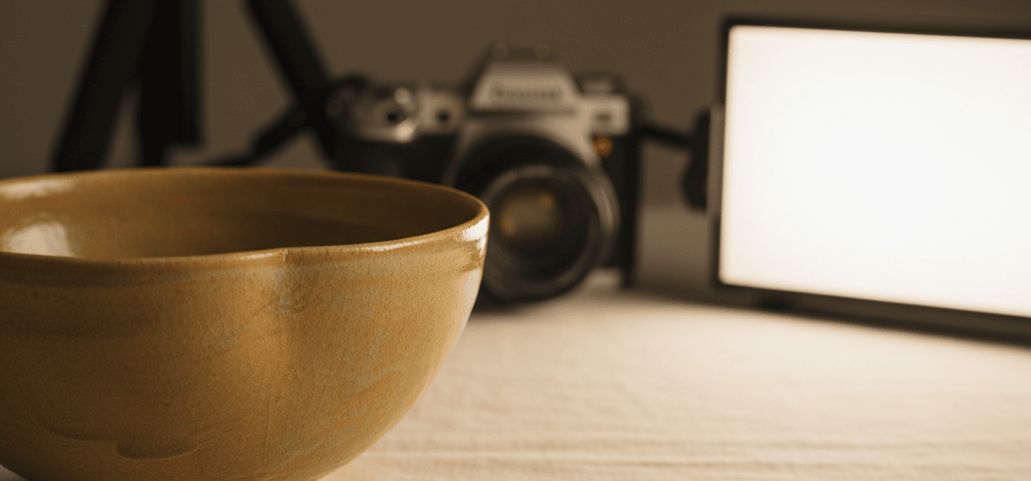
For artisan brands, this translates to simple affordable setups:
One LED panel as key light (continuous light, not flash, so you see results in real-time). Position 45 degrees to the side, elevated slightly.
White reflector as fill (foam core board or collapsible photography reflector). Position opposite the key light to bounce some light back into shadows.
Second light for background separation if budget allows. Or simply ensure background is far enough behind object that key light falloff creates natural separation.
Natural window light can work if you control it. Diffuse with sheer fabric to soften, use black fabric to block when needed, add reflectors to fill shadows. But understand that window light changes constantly—what works at 10 AM won’t work at 2 PM. Controlled artificial light maintains consistency across shooting sessions.
The Background Decision
Museums default to neutral gray backgrounds for most collection photography. Not stark white (creates harsh contrast with dark objects, can blow out to pure white and lose detail). Not black (can merge with dark objects, creates extreme contrast with light objects). Gray provides neutral middle ground.
But museums make exceptions based on object tone:
Black backgrounds for light-colored objects that would disappear against gray. White ceramics, light wood, pale textiles—these pop against black while maintaining all highlight detail.
White or light gray for very dark objects. Dark bronze, black-glazed ceramics, ebonized wood—these need lighter backgrounds to show silhouette and form.
Colored backgrounds rarely. Occasionally for specific interpretive purposes, but usually avoided because color can shift perception of object color through visual contrast effects.
For artisan brands:
Neutral backgrounds are safe defaults. Warm gray, taupe, or off-white linen or paper. These recede, letting your work advance.
Natural material backgrounds can add warmth without distraction. Aged wood, natural linen, raw plaster, stone—these provide texture that suggests craft context without competing for attention. But keep tones neutral—avoid strongly colored or busy-patterned surfaces.
Consistency matters more than perfection. Choose a background approach and maintain it across your portfolio. This creates visual coherence that feels systematic and professional.
What Museums Don’t Do (And Neither Should You)
Museum photography avoids practices common in commercial product photography:
No forced perspectives or dramatic angles. These create visual interest by distorting reality. Museums prioritize accurate representation over aesthetic drama. Your craft should be interesting enough that accurate documentation reveals its value.
No lifestyle staging or aspirational context. You won’t see museum furniture photographed in styled room settings with carefully chosen props suggesting desired lifestyles. The object stands alone. Its value is intrinsic, not dependent on context.
No editing that alters material character. No filters, no color shifts for aesthetic effect, no contrast exaggeration that makes images “pop” at the expense of accuracy. Museum images aim to show the object as faithfully as photography allows.
No text, graphics, or overlay messaging. The image speaks. No sale callouts, no branding, no website URLs obscuring the object. Documentation is pure—the object and nothing else.
For artisan brands building heritage positioning, these same principles apply. Your work’s quality should be self-evident in honest documentation. If you need dramatic angles, lifestyle staging, or aesthetic editing to make it look valuable, the problem isn’t the photography.
The Archival Perspective
Museums photograph collection objects knowing images will be used for decades: scholarly publications, educational materials, exhibition planning, conservation records. This long time horizon changes how they approach photography.
High resolution matters. Images must work printed large for exhibition graphics or reproduced in academic publications. Museums shoot at resolutions that maintain quality at substantial sizes.
Consistent file naming and metadata. Every image includes object accession number, date photographed, photographer name, lighting setup notes. Decades later, someone accessing the archive can understand exactly what they’re viewing.
Multiple format preservation. Original high-resolution files archived permanently, working files in accessible formats, web-optimized versions for digital use. The photography becomes permanent institutional record.
Artisan brands should think similarly:
Shoot at high resolution even if current use is web-only. You may need images for print publications, large-format exhibition, or licensing opportunities. Better to have resolution you don’t need yet than wish you’d shot higher quality.
Maintain master files permanently. Before editing, cropping, or optimizing for web, save full-resolution masters. These are your archive—the highest quality record of your work.
The Educational Function
Museum photography teaches viewers to see quality. Someone unfamiliar with Japanese tea ceremony tradition learns from detail shots what makes certain bowls culturally significant. The images become visual education in craft discernment.
Artisan brands can serve the same function:
Detail shots that reveal what quality looks like in your craft. This is what properly burnished leather edges look like. This is how hand-cut dovetails differ from machine-cut precision. This is the grain figure that makes quarter-sawn white oak valuable. You’re teaching clients to see what you see.
Process documentation that shows craft decisions. Not finished-only images, but key moments in making that reveal expertise. Wood selection, joinery fitting, finish application. These images help clients understand why your work justifies premium pricing—they see the accumulated decisions that mass production skips.
Comparison images that reveal quality differences. Museum textile conservation often includes side-by-side shots: original fabric next to deteriorated sections, or proper restoration next to previous poor repairs. Artisan brands can do similar: full-grain leather next to corrected leather showing how each ages, hand-cut dovetails beside machine-cut versions, oil finish beside polyurethane after five years of aging.
These educational images position you as authority, not just maker. You’re teaching discernment—the same role museums serve for their audiences.
The Consistency Principle Across Time
Museums maintain photographic standards across decades. A piece photographed in 1985 uses the same methodology as one documented in 2025—same lighting approach, background choices, compositional principles. This consistency allows direct visual comparison across collection objects and historical periods.
Artisan brands should think similarly:
Establish a photographic system and maintain it. As your portfolio grows over years, visual consistency communicates systematic quality standards. If early commissions are photographed with iPhone snapshots and recent work gets professional documentation, viewers wonder: has quality improved, or just photography? Consistency removes that question.
Update old documentation to current standards. When you refine your photographic approach, consider reshooting significant past work. A furniture maker’s best commission from 2020 deserves documentation equal to 2025 standards. If that piece represents your capability, its images should prove it.
Archive photographic methodology notes. How was this lit? What background? What camera settings? Years later when you need to match an aesthetic or reshoot for publication, these notes ensure consistency. Museums maintain this documentation religiously—you should too.
When Museum Standards Justify Investment
Not every artisan brand needs museum-level photography equipment. A $500 LED panel setup produces dramatically better results than iPhone snapshots. But certain situations justify hiring professional photographers who understand collection documentation standards:
Archive documentation of major commissions. When you complete work destined for public collections, private museum-quality collections, or gallery representation, that piece deserves professional documentation you’ll use for decades. Hire photographers who shoot for shelter magazines, auction houses, or museum catalogs—they understand the aesthetic.
Portfolio photography for significant career milestones. Exhibition work, award submissions, book publication, major press features. These opportunities require images that reproduce beautifully in print at large sizes and meet editorial publication standards.
When your photography time costs more than professional fees. If documenting eighteen annual commissions takes forty hours you could spend producing another $9,000 commission, hiring a photographer for $2,000 makes economic sense. But only if they understand quiet luxury aesthetics—avoid commercial product photographers whose portfolios emphasize dramatic styling over honest documentation.
Form Serves Truth, Photography Serves Record
Museum photography isn’t about making objects look better than they are. It’s about ensuring visual records accurately represent what exists: material character, construction technique, design philosophy, condition at time of documentation.
When those records are created with care—controlled lighting that reveals form, accurate color that represents materials faithfully, multiple angles that show complete understanding—they serve both immediate needs (helping current audiences appreciate quality) and long-term purposes (preserving craft knowledge for future study).
Artisan brands building work meant to last decades should document with the same seriousness. Not because every commission will end up in museums, but because the standard honors what you’ve made.
The Philadelphia Museum’s Chippendale chest photography doesn’t apologize for the object or enhance it artificially. The images simply reveal what’s there: exceptional proportion, masterful carving, joinery technique that has endured 250 years. The photography serves the object.
Your work deserves the same respect. Museum-quality lighting that reveals rather than flattens. Accurate color that represents material choices faithfully. Multiple perspectives that show complete understanding. Backgrounds that recede so craft advances.
This isn’t complicated or expensive. It’s systematic and intentional—the same qualities that define your craft. When documentation standards match making standards, the images become permanent record of what you’ve built and why it matters.
That record endures as long as the work itself. Which, if you’ve designed for patina and built for decades, is exactly as it should be.

The Quiet Luxury Dispatch
Reflections on craft, heritage, and digital stewardship.
Further Reading
The Editorial Eye: Why Artisan Brands Need Photography as Refined as Their Craft
A furniture maker spends eighty hours on a commission, then photographs it with an iPhone against his garage door. A jewelry house sources conflict-free stones for six months, then shoots finished pieces on white seamless with harsh overhead light. The disconnect between craft quality and visual documentation undermines everything artisan brands claim to value. If your work deserves decades of use, it deserves images that honor what you’ve made.
Why Artisan Brands Undercharge (And How to Stop)
Most heritage craftspeople price their work based on hours and materials, then add a modest margin. But discerning clients don’t buy hours—they buy decades of accumulated mastery, material philosophy, and the cultural value of owning something made to last generations. When artisan brands undercharge, they’re not being humble. They’re misunderstanding what they sell.
The Hand and the Machine: Where Artisan Brands Draw the Line
Heritage craftspeople face a paradox: modern business requires technological infrastructure, yet their value comes from handmade authenticity. The question isn’t whether to use AI and automation—it’s knowing exactly where technology serves the craft and where the human hand must remain. For artisan brands, that line determines whether you scale sustainably or compromise what makes you valuable.