The Editorial Eye: Why Artisan Brands Need Photography as Refined as Their Craft
A furniture maker spends eighty hours on a commission, then photographs it with an iPhone against his garage door. A jewelry house sources conflict-free stones for six months, then shoots finished pieces on white seamless with harsh overhead light. The disconnect between craft quality and visual documentation undermines everything artisan brands claim to value. If your work deserves decades of use, it deserves images that honor what you’ve made.
Share this post
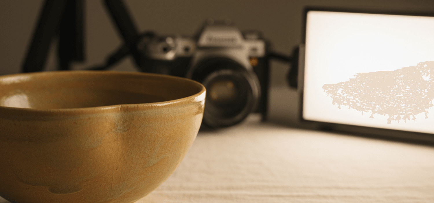
A second-generation ceramicist in North Carolina produces forty pieces annually. Each bowl takes three weeks: clay sourced from regional deposits, thrown on a wheel her grandfather built in 1958, glazed with formulas she’s refined over fifteen years, fired in a wood kiln that requires constant attention for thirty-six hours. The finished work sells for $800 to $2,400.
She photographs it on her kitchen counter with an iPhone, natural light streaming from a nearby window creating harsh shadows and blown-out highlights. The glaze—which shifts from celadon to deep emerald depending on viewing angle—reads as flat gray-green in her images. The thrown marks that reveal the maker’s hand are invisible. The weight and presence that makes collectors willing to pay $1,200 for a bowl doesn’t translate.
When prospects find her website, they see competent snapshots of exceptional work. And they move on, because nothing in those images suggests museum-quality craft. The disconnect between what she’s made and how she’s documented it costs her both credibility and revenue.
This is the most common visual mistake artisan brands make: treating photography as documentation rather than interpretation.
What Photography Actually Does
Mass-market brands photograph products to show features: color options, dimensions, functional details. The images exist to facilitate transactions—here’s what you’ll receive if you click “buy now.”
Heritage brands photograph craft to communicate values: material philosophy, maker’s hand, design restraint, the specific qualities that justify premium pricing and nine-month waitlists. The images don’t just show the object—they reveal what the object represents.
When someone commissions a $12,000 dining table from a third-generation furniture maker, they’re not buying wood assembled into a functional surface. They’re buying:
Material discernment that took decades to develop. The maker selected black walnut for figure and grain orientation that will reveal itself more beautifully over thirty years. That judgment—knowing which boards to choose and how to arrange them—doesn’t photograph automatically. It requires images that emphasize grain pattern, show light moving across the surface, demonstrate the three-dimensional depth that makes walnut valuable.
Technique invisible in the finished piece. Hand-cut dovetails that will hold for generations, mortise-and-tenon joinery that allows wood movement without failure, edge details shaped with hand planes. These craft elements exist beneath finish and function. Photography makes them visible and valued.
Design restraint that resists trend cycles. The table has no unnecessary ornamentation, no stylistic flourishes that will date it within five years. It’s quiet, refined, built to feel timeless in 2025 and 2055. Images need to communicate that restraint—generous negative space, neutral backgrounds, composition that lets the work speak without competing for attention.
The maker’s judgment embedded in every decision. Leg taper angle, proportion between top thickness and base mass, finish selection that will patina gracefully. These aren’t accidental—they’re the result of sustained mastery applied to this specific commission. Photography reveals that intentionality.
None of this happens with iPhone snapshots against garage doors. It requires photographic craft as meticulous as the object being documented.
The Museum Standard
Major museums don’t photograph collection pieces with natural window light and auto-exposure. They use controlled lighting that reveals form, texture, and material character. They compose images that honor the object’s proportions. They photograph from angles that show what the curator wants viewers to notice: a glaze detail, a joinery technique, the way light interacts with surface.
Artisan brands should adopt the same standard. Not because you need museum-level budgets, but because the principle scales: photograph your work the way it deserves to be seen, not the way it’s convenient to capture.
For the ceramicist, that means:
Controlled lighting that reveals glaze depth. Directional light from the side that shows how the surface shifts from celadon to emerald depending on angle. Controlled shadows that create dimension without obscuring detail. Lighting that makes the glaze feel alive rather than flat.
Composition that emphasizes craft details. Close shots showing thrown marks where her hands shaped the clay. Rim details that reveal thickness and evenness of throwing. Interior shots that show glaze pooling in recesses—the kind of detail that collectors notice and value.
Backgrounds that don’t compete. Neutral linen, aged wood, or stone surfaces that complement without distraction. No busy patterns, no colorful props, nothing that pulls attention from the work itself.
Multiple perspectives that tell the full story. Overhead shot showing form and proportion. Side angle revealing profile and silhouette. Detail shots of glaze character, foot ring craftsmanship, any marks or signatures. Each angle serves a purpose: helping the viewer understand what makes this piece worth $1,200.
This isn’t about making average work look exceptional. It’s about ensuring exceptional work looks as refined in images as it does in person.
What to Photograph (And What to Leave Out)
Quiet luxury brands understand that visual restraint communicates confidence. They don’t photograph everything—they photograph what matters.
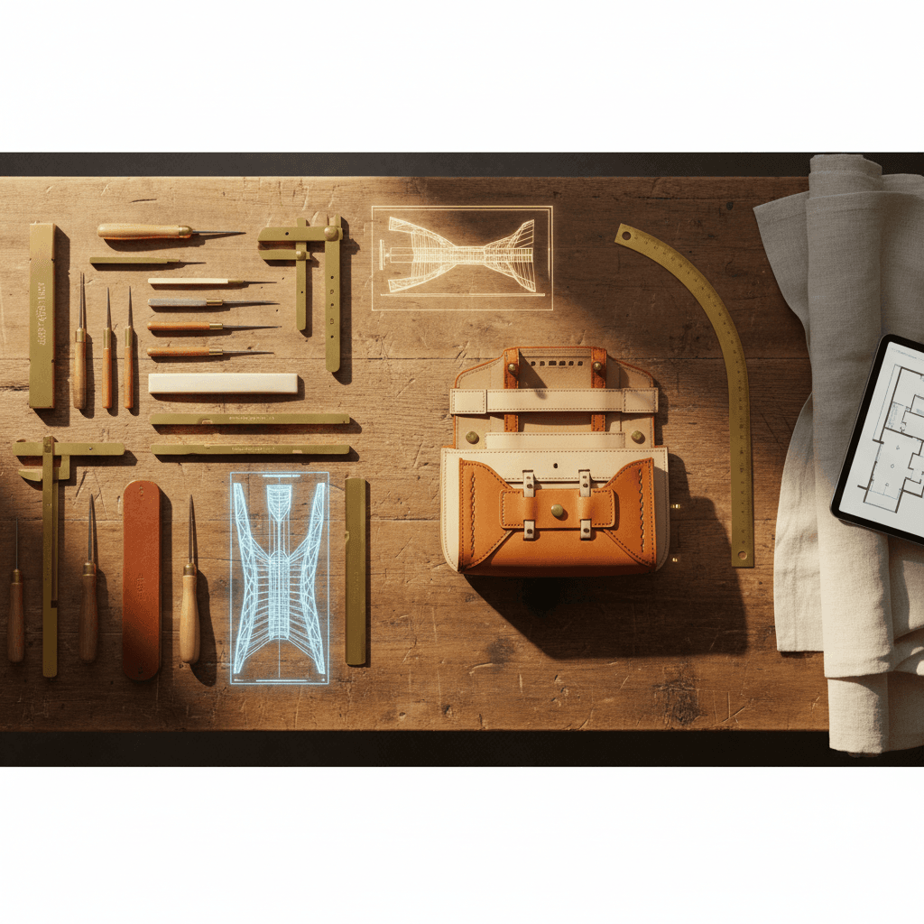
Photograph materials before they become finished work. Leather hides being inspected for grain quality. Lumber stacked for air-drying with dates marked on end grain. Raw clay being wedged to remove air bubbles. These process images establish material integrity: we source carefully, we prepare patiently, we don’t rush foundational steps that determine quality thirty years from now.
Photograph hands at work. Not posed “artisan lifestyle” shots with perfect lighting and clean hands holding tools they’re not actually using. Real documentation: hands beveling a leather edge, fingers checking dovetail fit, palms burnishing a wooden surface. These images prove the maker’s hand remains central—this isn’t automated production with artisan aesthetics.
Photograph workshop context selectively. A well-worn workbench with tools arranged from decades of use. A wood kiln being loaded for firing. Brass measuring tools passed down through generations. But not the full workshop chaos—the half-finished projects, the clutter, the fluorescent overhead lights. Curation matters. Show context that reinforces craft values, omit details that dilute the message.
Photograph finished work in context that honors its intended use. The dining table in a refined interior where quality design lives naturally. The ceramic bowl on a table set with linen and minimal styling. The leather bag carried by someone whose style aligns with quiet luxury aesthetics. But never in generic lifestyle scenes—no stock-photo families gathered around the table, no aspirational vacation settings. Context should feel authentic to your actual client base.
Don’t photograph price, urgency, or promotional messaging. No “Limited Time,” no sale graphics, no “Shop Now” overlays. Let the images stand as documentation of craft. Discerning clients will inquire based on quality alone—they don’t need visual pressure to act.
The Lighting Principle
Natural light feels authentic, which is why so many artisan brands default to window light and outdoor shooting. But natural light is inconsistent—it changes by hour, season, weather. And it’s often harsh, creating blown highlights and deep shadows that obscure detail.
Controlled lighting doesn’t mean studio flash and white backdrops. It means intentional light that reveals what you want viewers to see:
Directional light that creates dimension. Side-lighting that emphasizes texture and form. Backlighting that shows translucency in thin ceramics or the edge profile of hand-planed wood. Light positioned to create gentle shadows that suggest three-dimensional presence.
Soft light that shows material character without harshness. Diffused sources that wrap around curves, show glaze depth, reveal leather grain without creating hot spots that blow out to pure white.
Consistent light that allows coherent visual systems. When every piece is photographed under similar lighting conditions, your portfolio develops visual unity. Clients scrolling through your work see refined consistency—evidence of systematic craft standards rather than random snapshots.
This doesn’t require expensive equipment. A single continuous LED panel with diffusion, a reflector to fill shadows, and a neutral surface is enough. The investment is modest—$200 to $500—but the visual return is substantial.
Styling as Philosophy
The props, surfaces, and contexts surrounding your work communicate as much as the object itself. Styling choices reveal brand philosophy.
Generous negative space signals confidence. When an object occupies only 30% of the frame, surrounded by breathing room, the image says: this piece is so refined it doesn’t need visual competition. It commands attention through quality alone.
Natural materials as backgrounds reinforce craft values. Aged wood, linen, stone, raw plaster—surfaces with texture and history that complement handmade work. Avoid synthetic materials, glossy finishes, or anything that suggests mass production.
Minimal styling prevents distraction. One beautiful object photographed simply communicates more than five objects arranged in a curated still life. Restraint in composition mirrors restraint in design—both signal quiet luxury over visual noise.
Color palettes that recede rather than announce. Warm neutrals, soft earth tones, muted backgrounds that let the object’s material character provide color interest. No high-contrast black-and-white unless it serves a specific editorial purpose. No saturated colors that date the images to a particular trend moment.
The Consistency Principle
A leather goods maker photographs one bag beautifully—museum lighting, refined composition, perfect styling. The next bag gets iPhone snapshots. The third gets outdoor natural light with inconsistent exposure.
Clients viewing the portfolio wonder: Is the quality inconsistent, or just the photography? When visual documentation varies wildly, it undermines trust in craft consistency.
Establish a photographic system and maintain it:
Same lighting setup for all finished work. This doesn’t mean identical compositions—different pieces require different angles and framings—but consistent lighting quality that creates visual cohesion across your portfolio.
Same styling principles. If you photograph one piece on aged walnut surfaces, don’t photograph the next on white seamless. Visual systems communicate that craft systems are equally refined.
Same editing approach. Color temperature, contrast levels, saturation—these should remain consistent. Avoid trendy filters or dramatic editing that will date images. Aim for timeless, accurate color and refined tonal range that will look appropriate in five years.
When to Hire a Photographer
Many artisan brands can produce museum-quality documentation themselves with modest equipment and systematic practice. But certain situations justify hiring professional editorial photographers:
Launch imagery for new collections or major commissions. When a furniture maker completes a museum installation or gallery exhibition, those pieces deserve professional documentation that can be used for years—portfolio materials, press coverage, award submissions.
Brand photography that requires complex lighting or styling. Workshop portraits, process documentation with multiple simultaneous angles, or images requiring specific technical skills (focus stacking for extreme detail, large-format photography for maximum resolution).
When your time is more valuable spent on craft. If photographing eighteen bags annually takes forty hours that could produce another commission worth $9,000, hiring a photographer for $2,000 makes economic sense.
The key is finding photographers who understand quiet luxury aesthetics—those who shoot for shelter magazines, museum catalogs, or heritage brand campaigns. Show them references: Kinfolk, Cereal Magazine, museum collection photography. Avoid photographers whose portfolios emphasize dramatic styling, trendy editing, or commercial product photography aesthetics.
Form Serves Feeling, Images Serve Truth
Your photography isn’t marketing—it’s documentation of what you’ve made. The goal isn’t to make work look better than it is. The goal is to ensure images honor the quality already present.
When a second-generation jewelry house photographs conflict-free Montana sapphires in settings they’ve fabricated by hand, the images should reveal material integrity, technique mastery, and design restraint. Not through text or explanation, but through visual clarity: light moving through the stone, hand-finished metalwork shown in detail, composition that lets the piece speak.
When those images succeed, prospects don’t just see jewelry—they see values aligned with their own. They see evidence of the care they want applied to their commission. They see work worth waiting for and paying appropriately.
The ceramicist doesn’t need to explain why her bowls cost $1,200. If the images show glaze depth that rivals museum collections, thrown forms that reveal decades of wheel practice, and craft details that will last generations, discerning clients understand immediately.
Photography serves the same purpose as craft itself: ensuring that what you’ve built—whether object or brand—endures because quality announces itself without apology.

The Quiet Luxury Dispatch
Reflections on craft, heritage, and digital stewardship.
Further Reading
Why Artisan Brands Undercharge (And How to Stop)
Most heritage craftspeople price their work based on hours and materials, then add a modest margin. But discerning clients don’t buy hours—they buy decades of accumulated mastery, material philosophy, and the cultural value of owning something made to last generations. When artisan brands undercharge, they’re not being humble. They’re misunderstanding what they sell.
The Hand and the Machine: Where Artisan Brands Draw the Line
Heritage craftspeople face a paradox: modern business requires technological infrastructure, yet their value comes from handmade authenticity. The question isn’t whether to use AI and automation—it’s knowing exactly where technology serves the craft and where the human hand must remain. For artisan brands, that line determines whether you scale sustainably or compromise what makes you valuable.
The Invisible Foundation: Why Artisan Brands Need Architecture, Not Algorithms
When someone searches for artisan craftsmen or heritage brands, AI engines like ChatGPT and Perplexity decide what to recommend based on invisible technical architecture, not craft quality alone. Most artisan websites lack the structured data that tells these algorithms what the human eye already knows: this is mastery worth citing. For brands whose work deserves to be found by discerning clients, digital infrastructure must be as meticulous as the craft itself.